今回はfilterを使用したそのまま使えるスライダーアニメーションのマテリアルデザインを6つご紹介いたします。
scaleを使用してhoverすると画像が拡大するデザインに、多様なfilterを使用することで様々な場面(Web制作やWebアプリケーションなど)で利用できるデザインとなっています。
マテリアルデザインなのでそのまますぐにでもコピペして使用できるように仕上げました。htmlとcssだけしか使っていません。
この記事の信頼性(ゆうけんブログの筆者はこんな人)
- 現役Webデザイナーが執筆
- 最高月収7桁超のフリーランス
- 完全未経験から独学でWeb制作スキルを習得
- Twitterフォロワー数2,000人超(→@twinzvlog_yk)
- Web制作のメンター経験多数
- 認定ランサー(ランサーズ最高ランク)
コードの説明や実際の動きも詳しくまとめてみたので自由にお使いください。
こちらのデザイン・コードはすべて完全オリジナルなのでコピペ大歓迎です。
1. hoverで画像が半透明に?超便利なスライダーアニメーション
動きは下の画像のような感じになります
![]()
コードを見る
<div id="picture">
  <!-- チェックボックス -->
  <input type="radio" name="picture" id="pic1" checked>
  <input type="radio" name="picture" id="pic2">
  <input type="radio" name="picture" id="pic3">
  <input type="radio" name="picture" id="pic4">
  <div id="bg-pic">
    <div class="inside">
      <div class="pic pic_1">
      </div>
      <div class="pic pic_2">
      </div>
      <div class="pic pic_3">
      </div>
      <div class="pic pic_4">
      </div>
    </div>
  </div>
  <!-- スライダーのナビゲーションボタン -->
  <div id="slide-buttons">
    <label for="pic1"></label>
    <label for="pic2"></label>
    <label for="pic3"></label>
    <label for="pic4"></label>
  </div>
</div>
#picture {
   margin: 0 auto;
   width: 500px;
   max-width: 100%;
   text-align: center;
}
#picture input[type=radio] {
   display: none;
}
#picture label {
   cursor:pointer;
   text-decoration: none;
   padding: 5px;
}
#bg-pic {
   background: #fff;
   position: relative;
   z-index: 1;
   width: 100%;
   overflow: hidden;
   /* ボックスのはみ打た部分を隠す */
   transform: scale(1,1);
   /* XY軸(横縦)の伸縮率を指定 */
   transition-duration:.8s;
   /* アニメーションの開始から終了までの時間を指定 */
}
#bg-pic:hover {
  transform: scale(1.1,1.1);
  /* XY軸(横縦)の伸縮率を指定 */
}
/* スライダー画像の位置を比率で指定 */
#pic1:checked ~ #bg-pic .inside {
   margin-left: 0;
}
#pic2:checked ~ #bg-pic .inside {
   margin-left: -100%;
}
#pic3:checked ~ #bg-pic .inside {
   margin-left: -200%;
}
#pic4:checked ~ #bg-pic .inside {
   margin-left: -300%;
}
#bg-pic .inside {
   transition-duration:.8s;
   /* アニメーションの開始から終了までの時間を指定 */
   width: 400%;
   line-height: 0;
   height: 300px;
}
#bg-pic .pic {
   width: 25%;
   float:left;
   display: flex;
   justify-content: center;
   align-items: center;
   /* 上3行でボックスをど真ん中に指定 */
   height: 100%;
   background-size: cover;
   transition-duration:.8s;
   /* アニメーションの開始から終了までの時間を指定 */
   filter: opacity(100%);
   /* hover前:filterプロパティのopacityで透明度を指定 */
}
#bg-pic .pic:hover {
  background-size: cover;
  filter: opacity(50%);
  /* hover後:filterプロパティのopacityで透明度を指定 */
}
/* 画像urlを指定 */
#bg-pic .pic_1 {
   background-image: url("https://images.unsplash.com/photo-1473181488821-2d23949a045a?ixlib=rb-1.2.1&ixid=eyJhcHBfaWQiOjEyMDd9&auto=format&fit=crop&w=1650&q=80");
}
#bg-pic .pic_2 {
   background-image: url("https://images.unsplash.com/photo-1442323794357-25b2ec110967?ixlib=rb-1.2.1&ixid=eyJhcHBfaWQiOjEyMDd9&auto=format&fit=crop&w=2850&q=80");
}
#bg-pic .pic_3 {
   background-image: url("https://images.unsplash.com/photo-1498550744921-75f79806b8a7?ixlib=rb-1.2.1&ixid=eyJhcHBfaWQiOjEyMDd9&auto=format&fit=crop&w=1650&q=80");
}
#bg-pic .pic_4 {
   background-image: url("https://images.unsplash.com/photo-1476820865390-c52aeebb9891?ixlib=rb-1.2.1&ixid=eyJhcHBfaWQiOjEyMDd9&auto=format&fit=crop&w=1650&q=80");
}
/* スライダーの送りボタンを指定 */
#slide-buttons {
   margin: 50px 0 0;
   text-align: center;
}
#slide-buttons label {
   display: inline-block;
   width: 20px;
   height: 20px;
   border-radius:0%;
   background: gainsboro;
   margin: 0 10px;
   transform: scale(1,1);
   /* XY軸(横縦)の伸縮率を指定 */
   transition-duration:.5s;
   /* アニメーションの開始から終了までの時間を指定 */
}
#slide-buttons label:hover {
  transform: scale(1.5,1.5);
  /* XY軸(横縦)の伸縮率を指定 */
}
/* ナビゲーションボタンをcheckした時の背景色を指定 */
#pic1:checked ~ #slide-buttons label:nth-child(1),
#pic2:checked ~ #slide-buttons label:nth-child(2),
#pic3:checked ~ #slide-buttons label:nth-child(3),
#pic4:checked ~ #slide-buttons label:nth-child(4) {
   background: #444;
}
2. hoverで画像が色鮮やかになるスライダーアニメーション
動きは下の画像のような感じになります
![]()
コードを見る
<div id="picture">
  <!-- チェックボックス -->
  <input type="radio" name="picture" id="pic1" checked>
  <input type="radio" name="picture" id="pic2">
  <input type="radio" name="picture" id="pic3">
  <input type="radio" name="picture" id="pic4">
  <div id="bg-pic">
    <div class="inside">
      <div class="pic pic_1">
      </div>
      <div class="pic pic_2">
      </div>
      <div class="pic pic_3">
      </div>
      <div class="pic pic_4">
      </div>
    </div>
  </div>
  <!-- スライダーのナビゲーションボタン -->
  <div id="slide-buttons">
    <label for="pic1"></label>
    <label for="pic2"></label>
    <label for="pic3"></label>
    <label for="pic4"></label>
  </div>
</div>
#picture {
   margin: 0 auto;
   width: 500px;
   max-width: 100%;
   text-align: center;
}
#picture input[type=radio] {
   display: none;
}
#picture label {
   cursor:pointer;
   text-decoration: none;
   padding: 5px;
}
#bg-pic {
   background: #fff;
   position: relative;
   z-index: 1;
   width: 100%;
   overflow: hidden;
   /* ボックスのはみ打た部分を隠す */
   transform: scale(1,1);
   /* XY軸(横縦)の伸縮率を指定 */
   transition-duration:.8s;
   /* アニメーションの開始から終了までの時間を指定 */
}
#bg-pic:hover {
  transform: scale(1.1,1.1);
  /* XY軸(横縦)の伸縮率を指定 */
}
/* スライダー画像の位置を比率で指定 */
#pic1:checked ~ #bg-pic .inside {
   margin-left: 0;
}
#pic2:checked ~ #bg-pic .inside {
   margin-left: -100%;
}
#pic3:checked ~ #bg-pic .inside {
   margin-left: -200%;
}
#pic4:checked ~ #bg-pic .inside {
   margin-left: -300%;
}
#bg-pic .inside {
   transition-duration:.8s;
   /* アニメーションの開始から終了までの時間を指定 */
   width: 400%;
   line-height: 0;
   height: 300px;
}
#bg-pic .pic {
   width: 25%;
   float:left;
   display: flex;
   justify-content: center;
   align-items: center;
   /* 上3行でボックスをど真ん中に指定 */
   height: 100%;
   background-size: cover;
   transition-duration:.8s;
   /* アニメーションの開始から終了までの時間を指定 */
   filter: saturate(100%);
   /* hover前:filterプロパティの「彩度」 */
}
#bg-pic .pic:hover {
  background-size: cover;
  filter: saturate(200%);
  /* hover後:filterプロパティの「彩度」 */
}
/* 画像urlを指定 */
#bg-pic .pic_1 {
   background-image: url("https://images.unsplash.com/photo-1473181488821-2d23949a045a?ixlib=rb-1.2.1&ixid=eyJhcHBfaWQiOjEyMDd9&auto=format&fit=crop&w=1650&q=80");
}
#bg-pic .pic_2 {
   background-image: url("https://images.unsplash.com/photo-1442323794357-25b2ec110967?ixlib=rb-1.2.1&ixid=eyJhcHBfaWQiOjEyMDd9&auto=format&fit=crop&w=2850&q=80");
}
#bg-pic .pic_3 {
   background-image: url("https://images.unsplash.com/photo-1498550744921-75f79806b8a7?ixlib=rb-1.2.1&ixid=eyJhcHBfaWQiOjEyMDd9&auto=format&fit=crop&w=1650&q=80");
}
#bg-pic .pic_4 {
   background-image: url("https://images.unsplash.com/photo-1476820865390-c52aeebb9891?ixlib=rb-1.2.1&ixid=eyJhcHBfaWQiOjEyMDd9&auto=format&fit=crop&w=1650&q=80");
}
/* スライダーの送りボタンを指定 */
#slide-buttons {
   margin: 50px 0 0;
   text-align: center;
}
#slide-buttons label {
   display: inline-block;
   width: 20px;
   height: 20px;
   border-radius:0%;
   background: gainsboro;
   margin: 0 10px;
   transform: scale(1,1);
   /* XY軸(横縦)の伸縮率を指定 */
   transition-duration:.5s;
   /* アニメーションの開始から終了までの時間を指定 */
}
#slide-buttons label:hover {
  transform: scale(1.5,1.5);
  /* XY軸(横縦)の伸縮率を指定 */
}
/* ナビゲーションボタンをcheckした時の背景色を指定 */
#pic1:checked ~ #slide-buttons label:nth-child(1),
#pic2:checked ~ #slide-buttons label:nth-child(2),
#pic3:checked ~ #slide-buttons label:nth-child(3),
#pic4:checked ~ #slide-buttons label:nth-child(4) {
   background: #444;
}
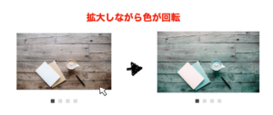
3. hoverで画像の色が暴れ出すスライダーアニメーション
動きは下の画像のような感じになります
![]()
コードを見る
<div id="picture">
  <!-- チェックボックス -->
  <input type="radio" name="picture" id="pic1" checked>
  <input type="radio" name="picture" id="pic2">
  <input type="radio" name="picture" id="pic3">
  <input type="radio" name="picture" id="pic4">
  <div id="bg-pic">
    <div class="inside">
      <div class="pic pic_1">
      </div>
      <div class="pic pic_2">
      </div>
      <div class="pic pic_3">
      </div>
      <div class="pic pic_4">
      </div>
    </div>
  </div>
  <!-- スライダーのナビゲーションボタン -->
  <div id="slide-buttons">
    <label for="pic1"></label>
    <label for="pic2"></label>
    <label for="pic3"></label>
    <label for="pic4"></label>
  </div>
</div>
#picture {
   margin: 0 auto;
   width: 500px;
   max-width: 100%;
   text-align: center;
}
#picture input[type=radio] {
   display: none;
}
#picture label {
   cursor:pointer;
   text-decoration: none;
   padding: 5px;
}
#bg-pic {
   background: #fff;
   position: relative;
   z-index: 1;
   width: 100%;
   overflow: hidden;
   /* ボックスのはみ打た部分を隠す */
   transform: scale(1,1);
   /* XY軸(横縦)の伸縮率を指定 */
   transition-duration:.8s;
   /* アニメーションの開始から終了までの時間を指定 */
}
#bg-pic:hover {
  transform: scale(1.1,1.1);
  /* XY軸(横縦)の伸縮率を指定 */
}
/* スライダー画像の位置を比率で指定 */
#pic1:checked ~ #bg-pic .inside {
   margin-left: 0;
}
#pic2:checked ~ #bg-pic .inside {
   margin-left: -100%;
}
#pic3:checked ~ #bg-pic .inside {
   margin-left: -200%;
}
#pic4:checked ~ #bg-pic .inside {
   margin-left: -300%;
}
#bg-pic .inside {
   transition-duration:.8s;
   /* アニメーションの開始から終了までの時間を指定 */
   width: 400%;
   line-height: 0;
   height: 300px;
}
#bg-pic .pic {
   width: 25%;
   float:left;
   display: flex;
   justify-content: center;
   align-items: center;
   /* 上3行でボックスをど真ん中に指定 */
   height: 100%;
   background-size: cover;
   transition-duration:.8s;
   /* アニメーションの開始から終了までの時間を指定 */
   filter: hue-rotate(0deg);
   /* hover前:filterプロパティの「色の回転角度」 */
}
#bg-pic .pic:hover {
  background-size: cover;
  filter: hue-rotate(500deg);
  /* hover後:filterプロパティの「色の回転角度」 */
}
/* 画像urlを指定 */
#bg-pic .pic_1 {
   background-image: url("https://images.unsplash.com/photo-1473181488821-2d23949a045a?ixlib=rb-1.2.1&ixid=eyJhcHBfaWQiOjEyMDd9&auto=format&fit=crop&w=1650&q=80");
}
#bg-pic .pic_2 {
   background-image: url("https://images.unsplash.com/photo-1442323794357-25b2ec110967?ixlib=rb-1.2.1&ixid=eyJhcHBfaWQiOjEyMDd9&auto=format&fit=crop&w=2850&q=80");
}
#bg-pic .pic_3 {
   background-image: url("https://images.unsplash.com/photo-1498550744921-75f79806b8a7?ixlib=rb-1.2.1&ixid=eyJhcHBfaWQiOjEyMDd9&auto=format&fit=crop&w=1650&q=80");
}
#bg-pic .pic_4 {
   background-image: url("https://images.unsplash.com/photo-1476820865390-c52aeebb9891?ixlib=rb-1.2.1&ixid=eyJhcHBfaWQiOjEyMDd9&auto=format&fit=crop&w=1650&q=80");
}
/* スライダーの送りボタンを指定 */
#slide-buttons {
   margin: 50px 0 0;
   text-align: center;
}
#slide-buttons label {
   display: inline-block;
   width: 20px;
   height: 20px;
   border-radius:0%;
   background: gainsboro;
   margin: 0 10px;
   transform: scale(1,1);
   /* XY軸(横縦)の伸縮率を指定 */
   transition-duration:.5s;
   /* アニメーションの開始から終了までの時間を指定 */
}
#slide-buttons label:hover {
  transform: scale(1.5,1.5);
  /* XY軸(横縦)の伸縮率を指定 */
}
/* ナビゲーションボタンをcheckした時の背景色を指定 */
#pic1:checked ~ #slide-buttons label:nth-child(1),
#pic2:checked ~ #slide-buttons label:nth-child(2),
#pic3:checked ~ #slide-buttons label:nth-child(3),
#pic4:checked ~ #slide-buttons label:nth-child(4) {
   background: #444;
}
4. hoverで画像が霞んで趣が出るスライダーアニメーション
動きは下の画像のような感じになります
![]()
コードを見る
<div id="picture">
  <!-- チェックボックス -->
  <input type="radio" name="picture" id="pic1" checked>
  <input type="radio" name="picture" id="pic2">
  <input type="radio" name="picture" id="pic3">
  <input type="radio" name="picture" id="pic4">
  <div id="bg-pic">
    <div class="inside">
      <div class="pic pic_1">
      </div>
      <div class="pic pic_2">
      </div>
      <div class="pic pic_3">
      </div>
      <div class="pic pic_4">
      </div>
    </div>
  </div>
  <!-- スライダーのナビゲーションボタン -->
  <div id="slide-buttons">
    <label for="pic1"></label>
    <label for="pic2"></label>
    <label for="pic3"></label>
    <label for="pic4"></label>
  </div>
</div>
#picture {
   margin: 0 auto;
   width: 500px;
   max-width: 100%;
   text-align: center;
}
#picture input[type=radio] {
   display: none;
}
#picture label {
   cursor:pointer;
   text-decoration: none;
   padding: 5px;
}
#bg-pic {
   background: #fff;
   position: relative;
   z-index: 1;
   width: 100%;
   overflow: hidden;
   /* ボックスのはみ打た部分を隠す */
   transform: scale(1,1);
   /* XY軸(横縦)の伸縮率を指定 */
   transition-duration:.8s;
   /* アニメーションの開始から終了までの時間を指定 */
}
#bg-pic:hover {
  transform: scale(1.1,1.1);
  /* XY軸(横縦)の伸縮率を指定 */
}
/* スライダー画像の位置を比率で指定 */
#pic1:checked ~ #bg-pic .inside {
   margin-left: 0;
}
#pic2:checked ~ #bg-pic .inside {
   margin-left: -100%;
}
#pic3:checked ~ #bg-pic .inside {
   margin-left: -200%;
}
#pic4:checked ~ #bg-pic .inside {
   margin-left: -300%;
}
#bg-pic .inside {
   transition-duration:.8s;
   /* アニメーションの開始から終了までの時間を指定 */
   width: 400%;
   line-height: 0;
   height: 300px;
}
#bg-pic .pic {
   width: 25%;
   float:left;
   display: flex;
   justify-content: center;
   align-items: center;
   /* 上3行でボックスをど真ん中に指定 */
   height: 100%;
   background-size: cover;
   transition-duration:.8s;
   /* アニメーションの開始から終了までの時間を指定 */
   filter: sepia(0%);
   /* hover前:filterプロパティの「セピア」 */
}
#bg-pic .pic:hover {
  background-size: cover;
  filter: sepia(60%);
  /* hover後:filterプロパティの「セピア」 */
}
/* 画像urlを指定 */
#bg-pic .pic_1 {
   background-image: url("https://images.unsplash.com/photo-1473181488821-2d23949a045a?ixlib=rb-1.2.1&ixid=eyJhcHBfaWQiOjEyMDd9&auto=format&fit=crop&w=1650&q=80");
}
#bg-pic .pic_2 {
   background-image: url("https://images.unsplash.com/photo-1442323794357-25b2ec110967?ixlib=rb-1.2.1&ixid=eyJhcHBfaWQiOjEyMDd9&auto=format&fit=crop&w=2850&q=80");
}
#bg-pic .pic_3 {
   background-image: url("https://images.unsplash.com/photo-1498550744921-75f79806b8a7?ixlib=rb-1.2.1&ixid=eyJhcHBfaWQiOjEyMDd9&auto=format&fit=crop&w=1650&q=80");
}
#bg-pic .pic_4 {
   background-image: url("https://images.unsplash.com/photo-1476820865390-c52aeebb9891?ixlib=rb-1.2.1&ixid=eyJhcHBfaWQiOjEyMDd9&auto=format&fit=crop&w=1650&q=80");
}
/* スライダーの送りボタンを指定 */
#slide-buttons {
   margin: 50px 0 0;
   text-align: center;
}
#slide-buttons label {
   display: inline-block;
   width: 20px;
   height: 20px;
   border-radius:0%;
   background: gainsboro;
   margin: 0 10px;
   transform: scale(1,1);
   /* XY軸(横縦)の伸縮率を指定 */
   transition-duration:.5s;
   /* アニメーションの開始から終了までの時間を指定 */
}
#slide-buttons label:hover {
  transform: scale(1.5,1.5);
  /* XY軸(横縦)の伸縮率を指定 */
}
/* ナビゲーションボタンをcheckした時の背景色を指定 */
#pic1:checked ~ #slide-buttons label:nth-child(1),
#pic2:checked ~ #slide-buttons label:nth-child(2),
#pic3:checked ~ #slide-buttons label:nth-child(3),
#pic4:checked ~ #slide-buttons label:nth-child(4) {
   background: #444;
}
5. hoverでモノクロ画像が200倍色鮮やかになるスライダーアニメーション
動きは下の画像のような感じになります
![]()
コードを見る
<div id="picture">
  <!-- チェックボックス -->
  <input type="radio" name="picture" id="pic1" checked>
  <input type="radio" name="picture" id="pic2">
  <input type="radio" name="picture" id="pic3">
  <input type="radio" name="picture" id="pic4">
  <div id="bg-pic">
    <div class="inside">
      <div class="pic pic_1">
      </div>
      <div class="pic pic_2">
      </div>
      <div class="pic pic_3">
      </div>
      <div class="pic pic_4">
      </div>
    </div>
  </div>
  <!-- スライダーのナビゲーションボタン -->
  <div id="slide-buttons">
    <label for="pic1"></label>
    <label for="pic2"></label>
    <label for="pic3"></label>
    <label for="pic4"></label>
  </div>
</div>
#picture {
   margin: 0 auto;
   width: 500px;
   max-width: 100%;
   text-align: center;
}
#picture input[type=radio] {
   display: none;
}
#picture label {
   cursor:pointer;
   text-decoration: none;
   padding: 5px;
}
#bg-pic {
   background: #fff;
   position: relative;
   z-index: 1;
   width: 100%;
   overflow: hidden;
   /* ボックスのはみ打た部分を隠す */
   transform: scale(1,1);
   /* XY軸(横縦)の伸縮率を指定 */
   transition-duration:.8s;
   /* アニメーションの開始から終了までの時間を指定 */
}
#bg-pic:hover {
  transform: scale(1.1,1.1);
  /* XY軸(横縦)の伸縮率を指定 */
}
/* スライダー画像の位置を比率で指定 */
#pic1:checked ~ #bg-pic .inside {
   margin-left: 0;
}
#pic2:checked ~ #bg-pic .inside {
   margin-left: -100%;
}
#pic3:checked ~ #bg-pic .inside {
   margin-left: -200%;
}
#pic4:checked ~ #bg-pic .inside {
   margin-left: -300%;
}
#bg-pic .inside {
   transition-duration:.8s;
   /* アニメーションの開始から終了までの時間を指定 */
   width: 400%;
   line-height: 0;
   height: 300px;
}
#bg-pic .pic {
   width: 25%;
   float:left;
   display: flex;
   justify-content: center;
   align-items: center;
   /* 上3行でボックスをど真ん中に指定 */
   height: 100%;
   background-size: cover;
   transition-duration:.8s;
   /* アニメーションの開始から終了までの時間を指定 */
   filter: grayscale(100%) saturate(100%);
   /* hover前:filterプロパティの「モノクロ」+「彩度」 */
}
#bg-pic .pic:hover {
  background-size: cover;
  filter: grayscale(0%) saturate(200%);
  /* hover後:filterプロパティの「モノクロ」+「彩度」 */
}
/* 画像urlを指定 */
#bg-pic .pic_1 {
   background-image: url("https://images.unsplash.com/photo-1473181488821-2d23949a045a?ixlib=rb-1.2.1&ixid=eyJhcHBfaWQiOjEyMDd9&auto=format&fit=crop&w=1650&q=80");
}
#bg-pic .pic_2 {
   background-image: url("https://images.unsplash.com/photo-1442323794357-25b2ec110967?ixlib=rb-1.2.1&ixid=eyJhcHBfaWQiOjEyMDd9&auto=format&fit=crop&w=2850&q=80");
}
#bg-pic .pic_3 {
   background-image: url("https://images.unsplash.com/photo-1498550744921-75f79806b8a7?ixlib=rb-1.2.1&ixid=eyJhcHBfaWQiOjEyMDd9&auto=format&fit=crop&w=1650&q=80");
}
#bg-pic .pic_4 {
   background-image: url("https://images.unsplash.com/photo-1476820865390-c52aeebb9891?ixlib=rb-1.2.1&ixid=eyJhcHBfaWQiOjEyMDd9&auto=format&fit=crop&w=1650&q=80");
}
/* スライダーの送りボタンを指定 */
#slide-buttons {
   margin: 50px 0 0;
   text-align: center;
}
#slide-buttons label {
   display: inline-block;
   width: 20px;
   height: 20px;
   border-radius:0%;
   background: gainsboro;
   margin: 0 10px;
   transform: scale(1,1);
   /* XY軸(横縦)の伸縮率を指定 */
   transition-duration:.5s;
   /* アニメーションの開始から終了までの時間を指定 */
}
#slide-buttons label:hover {
  transform: scale(1.5,1.5);
  /* XY軸(横縦)の伸縮率を指定 */
}
/* ナビゲーションボタンをcheckした時の背景色を指定 */
#pic1:checked ~ #slide-buttons label:nth-child(1),
#pic2:checked ~ #slide-buttons label:nth-child(2),
#pic3:checked ~ #slide-buttons label:nth-child(3),
#pic4:checked ~ #slide-buttons label:nth-child(4) {
   background: #444;
}
6. hoverで半透明の画像が1000倍輝くスライダーアニメーション
動きは下の画像のような感じになります
![]()
コードを見る
<div id="picture">
  <!-- チェックボックス -->
  <input type="radio" name="picture" id="pic1" checked>
  <input type="radio" name="picture" id="pic2">
  <input type="radio" name="picture" id="pic3">
  <input type="radio" name="picture" id="pic4">
  <div id="bg-pic">
    <div class="inside">
      <div class="pic pic_1">
      </div>
      <div class="pic pic_2">
      </div>
      <div class="pic pic_3">
      </div>
      <div class="pic pic_4">
      </div>
    </div>
  </div>
  <!-- スライダーのナビゲーションボタン -->
  <div id="slide-buttons">
    <label for="pic1"></label>
    <label for="pic2"></label>
    <label for="pic3"></label>
    <label for="pic4"></label>
  </div>
</div>
#picture {
   margin: 0 auto;
   width: 500px;
   max-width: 100%;
   text-align: center;
}
#picture input[type=radio] {
   display: none;
}
#picture label {
   cursor:pointer;
   text-decoration: none;
   padding: 5px;
}
#bg-pic {
   background: #fff;
   position: relative;
   z-index: 1;
   width: 100%;
   overflow: hidden;
   /* ボックスのはみ打た部分を隠す */
   transform: scale(1,1);
   /* XY軸(横縦)の伸縮率を指定 */
   transition-duration:.8s;
   /* アニメーションの開始から終了までの時間を指定 */
}
#bg-pic:hover {
  transform: scale(1.1,1.1);
  /* XY軸(横縦)の伸縮率を指定 */
}
/* スライダー画像の位置を比率で指定 */
#pic1:checked ~ #bg-pic .inside {
   margin-left: 0;
}
#pic2:checked ~ #bg-pic .inside {
   margin-left: -100%;
}
#pic3:checked ~ #bg-pic .inside {
   margin-left: -200%;
}
#pic4:checked ~ #bg-pic .inside {
   margin-left: -300%;
}
#bg-pic .inside {
   transition-duration:.8s;
   /* アニメーションの開始から終了までの時間を指定 */
   width: 400%;
   line-height: 0;
   height: 300px;
}
#bg-pic .pic {
   width: 25%;
   float:left;
   display: flex;
   justify-content: center;
   align-items: center;
   /* 上3行でボックスをど真ん中に指定 */
   height: 100%;
   background-size: cover;
   transition-duration:.8s;
   /* アニメーションの開始から終了までの時間を指定 */
   filter: opacity(50%) brightness(80%) saturate(80%);
   /* hover前:filterプロパティの「透明度」+「明るさ」+「彩度」 */
}
#bg-pic .pic:hover {
  background-size: cover;
  filter: opacity(100%) brightness(115%) saturate(200%);
  /* hover後:filterプロパティの「透明度」+「明るさ」+「彩度」 */
}
/* 画像urlを指定 */
#bg-pic .pic_1 {
   background-image: url("https://images.unsplash.com/photo-1473181488821-2d23949a045a?ixlib=rb-1.2.1&ixid=eyJhcHBfaWQiOjEyMDd9&auto=format&fit=crop&w=1650&q=80");
}
#bg-pic .pic_2 {
   background-image: url("https://images.unsplash.com/photo-1442323794357-25b2ec110967?ixlib=rb-1.2.1&ixid=eyJhcHBfaWQiOjEyMDd9&auto=format&fit=crop&w=2850&q=80");
}
#bg-pic .pic_3 {
   background-image: url("https://images.unsplash.com/photo-1498550744921-75f79806b8a7?ixlib=rb-1.2.1&ixid=eyJhcHBfaWQiOjEyMDd9&auto=format&fit=crop&w=1650&q=80");
}
#bg-pic .pic_4 {
   background-image: url("https://images.unsplash.com/photo-1476820865390-c52aeebb9891?ixlib=rb-1.2.1&ixid=eyJhcHBfaWQiOjEyMDd9&auto=format&fit=crop&w=1650&q=80");
}
/* スライダーの送りボタンを指定 */
#slide-buttons {
   margin: 50px 0 0;
   text-align: center;
}
#slide-buttons label {
   display: inline-block;
   width: 20px;
   height: 20px;
   border-radius:0%;
   background: gainsboro;
   margin: 0 10px;
   transform: scale(1,1);
   /* XY軸(横縦)の伸縮率を指定 */
   transition-duration:.5s;
   /* アニメーションの開始から終了までの時間を指定 */
}
#slide-buttons label:hover {
  transform: scale(1.5,1.5);
  /* XY軸(横縦)の伸縮率を指定 */
}
/* ナビゲーションボタンをcheckした時の背景色を指定 */
#pic1:checked ~ #slide-buttons label:nth-child(1),
#pic2:checked ~ #slide-buttons label:nth-child(2),
#pic3:checked ~ #slide-buttons label:nth-child(3),
#pic4:checked ~ #slide-buttons label:nth-child(4) {
   background: #444;
}
『絶対にリモートワーク!』という方におすすめの求人サイトをご紹介!
クラウドテック
この講座のポイント
対象
Webデザイナー・エンジニア・グラフィックデザイナー・PM・マーケター・ライター
公式サイト
クラウドテック公式ページ
特徴
- クラウドソーシング企業大手のクラウドワークスが運営する求人サイト
- 実務未経験者でもOK
- 登録社数14万社
- フリーランス・個人事業主向け案件がケタ違いに多い
- 報酬額や勤務地・職種など希望が通りやすい
- Web制作・コーディングの高単価案件が多い
- リモートワーク案件数は業界トップクラス
- 最短3日で案件を獲得できる
現役Webデザイナーの筆者イチオシの求人サイト!フリーランス向けWeb制作案件なら確実に業界トップクラス。営業かけずに案件に困らなくなる一番の近道です。
 ふたご
ふたご
無料で登録してみる >>
まとめ
![]()
HTMLとCSSを使うと今回紹介したようなことも簡単にできてしまうんです。
『CSSアニメーションやエフェクトだけではなくWebサイトをゼロから作って稼いでいきたい』
『3ヶ月くらいで最低でも月10万円は稼ぎたい』
『営業とかやったことないけどWeb制作だけで稼いでいきたい』
こんな方のためにWeb制作で月80万超稼ぐ筆者が自身の経験を踏まえて【失敗しない】Webデザイナー(Web制作)独学ロードマップを執筆しました。
少額の投資で3ヶ月後には月10〜30万稼げるよう設計してあります。
(学習教材やAdobeなど最低限のコストはかかります)
ロードマップの構成
- Web制作に特化した『確実に身に付く』学習方法
- Web制作会社が喰いつく理想的なポートフォリオの作成手順
- 返信率10%以上!Web制作会社へのメール営業
有料公開も考えましたが「Webデザイナー(Web制作)はまだまだ稼げることを証明したい!」という思いが強く、期間限定で無料公開をすることにしました。
2021年半ばまでは無料公開する予定ではありますが前倒しすることもあり得ますのでご興味ある方はお早めにどうぞ!