今回はシンプルなスライダーにコントロールボタン(スライダー画像の両側に設置する画像を入れ替えるためのボタン)を設置し、ボタンのデザインを変更していきます。
そのまま使えるスライダーアニメーションのマテリアルデザインが3つとなっています。
transform:scaleやopacityを使用してhoverするとコントロールボタンが拡大したり色が濃くなるようなデザインとなっています。
マテリアルデザインなのでそのまますぐにでもコピペして使用できるように仕上げました。
htmlとcssだけしか使っていません。
コードの説明や実際の動きも詳しくまとめてみたので自由にお使いください。
こちらのデザイン・コードはすべて完全オリジナルなのでコピペ大歓迎です。
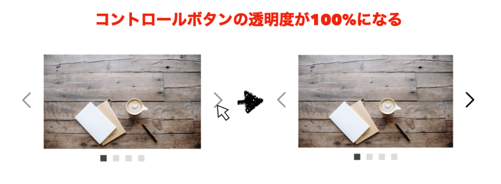
1. hoverでコントロールボタンの色が濃くなるスライダーアニメーション
動きは下の画像のような感じになります
![]()
コードを見る
<div id="picture">
  <!-- チェックボックス -->
  <input type="radio" name="picture" id="pic1" checked>
  <input type="radio" name="picture" id="pic2">
  <input type="radio" name="picture" id="pic3">
  <input type="radio" name="picture" id="pic4">
  <div id="bg-pic">
    <div class="inside">
      <div class="pic pic_1">
      </div>
      <div class="pic pic_2">
      </div>
      <div class="pic pic_3">
      </div>
      <div class="pic pic_4">
      </div>
    </div>
  </div>
  <!-- スライダーのコントロールボタンを指定 -->
  <div id="slide-controls">
    <label for="pic1"></label>
    <label for="pic2"></label>
    <label for="pic3"></label>
    <label for="pic4"></label>
  </div>
  <!-- スライダーのナビゲーションボタン -->
  <div id="slide-buttons">
    <label for="pic1"></label>
    <label for="pic2"></label>
    <label for="pic3"></label>
    <label for="pic4"></label>
  </div>
</div>
#picture {
   margin: 0 auto;
   width: 500px;
   max-width: 100%;
   text-align: center;
}
#picture input[type=radio] {
   display: none;
}
#picture label {
   cursor:pointer;
   text-decoration: none;
   padding: 5px;
}
#bg-pic {
   background: #fff;
   position: relative;
   z-index: 1;
   width: 100%;
   overflow: hidden;
   /* ボックスのはみ打た部分を隠す */
}
/* スライダー画像の位置を比率で指定 */
#pic1:checked ~ #bg-pic .inside {
   margin-left: 0;
}
#pic2:checked ~ #bg-pic .inside {
   margin-left: -100%;
}
#pic3:checked ~ #bg-pic .inside {
   margin-left: -200%;
}
#pic4:checked ~ #bg-pic .inside {
   margin-left: -300%;
}
#bg-pic .inside {
   transition-duration:.8s;
   /* アニメーションの開始から終了までの時間を指定 */
   width: 400%;
   line-height: 0;
   height: 300px;
}
#bg-pic .pic {
   width: 25%;
   float:left;
   display: flex;
   justify-content: center;
   align-items: center;
   /* 上3行でボックスをど真ん中に指定 */
   height: 100%;
   background-size: cover;
}
/* 画像urlを指定 */
#bg-pic .pic_1 {
   background-image: url("https://images.unsplash.com/photo-1473181488821-2d23949a045a?ixlib=rb-1.2.1&ixid=eyJhcHBfaWQiOjEyMDd9&auto=format&fit=crop&w=1650&q=80");
}
#bg-pic .pic_2 {
   background-image: url("https://images.unsplash.com/photo-1442323794357-25b2ec110967?ixlib=rb-1.2.1&ixid=eyJhcHBfaWQiOjEyMDd9&auto=format&fit=crop&w=2850&q=80");
}
#bg-pic .pic_3 {
   background-image: url("https://images.unsplash.com/photo-1498550744921-75f79806b8a7?ixlib=rb-1.2.1&ixid=eyJhcHBfaWQiOjEyMDd9&auto=format&fit=crop&w=1650&q=80");
}
#bg-pic .pic_4 {
   background-image: url("https://images.unsplash.com/photo-1476820865390-c52aeebb9891?ixlib=rb-1.2.1&ixid=eyJhcHBfaWQiOjEyMDd9&auto=format&fit=crop&w=1650&q=80");
}
/* スライダーのコントロールボタンを指定 */
#slide-controls {
   margin: -180px 0 0 0;
   width: 100%;
   height: 50px;
   z-index: 3;
   position: relative;
}
#slide-controls label {
   display: none;
   width: 50px;
   height: 50px;
   opacity: .4;
   /* 透明度を指定 */
   transition:opacity .2s ease-out;
   /* アニメーションの開始から終了までの時間を指定 */
}
#slide-controls label:hover {
   opacity: 1;
   /* 透明度を指定 */
}
#pic1:checked ~ #slide-controls label:nth-child(2),
#pic2:checked ~ #slide-controls label:nth-child(3),
#pic3:checked ~ #slide-controls label:nth-child(4),
#pic4:checked ~ #slide-controls label:nth-child(1) {
   background: url(https://image.flaticon.com/icons/svg/130/130884.svg) no-repeat;
   float:right;
   margin: 0 -80px 0 0;
   display: block;
}
#pic1:checked ~ #slide-controls label:nth-last-child(2),
#pic2:checked ~ #slide-controls label:nth-last-child(3),
#pic3:checked ~ #slide-controls label:nth-last-child(4),
#pic4:checked ~ #slide-controls label:nth-last-child(1) {
   background: url(https://image.flaticon.com/icons/svg/130/130882.svg) no-repeat;
   float:left;
   margin: 0 0 0 -80px;
   display: block;
}
/* スライダーの送りボタンを指定 */
#slide-buttons {
   margin: 150px 0 0;
   text-align: center;
}
#slide-buttons label {
   display: inline-block;
   width: 20px;
   height: 20px;
   border-radius:0%;
   background: gainsboro;
   margin: 0 10px;
   transform: scale(1,1);
   /* XY軸(横縦)の伸縮率を指定 */
   transition-duration:.5s;
   /* アニメーションの開始から終了までの時間を指定 */
}
#slide-buttons label:hover {
  transform: scale(1.5,1.5);
  /* XY軸(横縦)の伸縮率を指定 */
}
/* ナビゲーションボタンをcheckした時の背景色を指定 */
#pic1:checked ~ #slide-buttons label:nth-child(1),
#pic2:checked ~ #slide-buttons label:nth-child(2),
#pic3:checked ~ #slide-buttons label:nth-child(3),
#pic4:checked ~ #slide-buttons label:nth-child(4) {
   background: #444;
}
ここがポイント!
- flexboxでbg-picの中身をど真ん中に設置
- スライダーのナビゲーションボタンを設置しボタンを押すと画像がスライドするように指定する
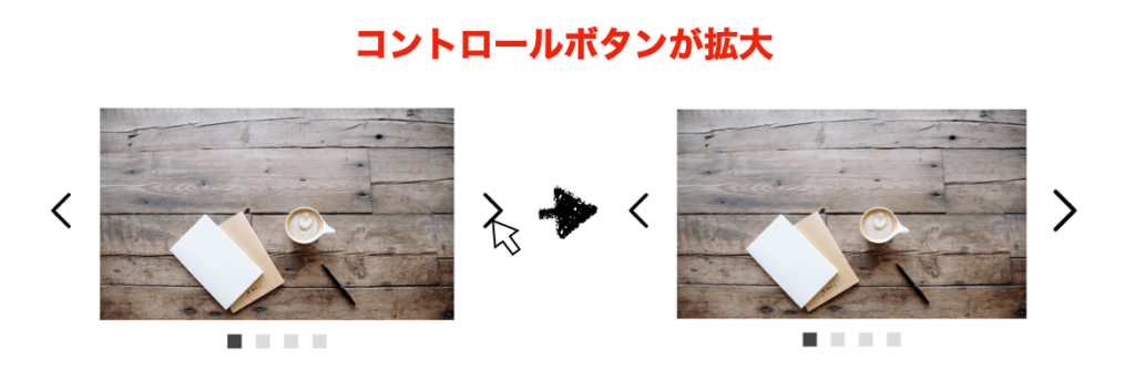
- ナビゲーションボタンをhoverするとtransform:scaleでボタンが拡大するマテリアルデザイン(transformの使い方については【transform完全網羅】hoverで動き出す!transformを網羅できるCSSボタンアニメーション16選)
- スライダーのコントロールボタンをhoverすると透明度を調整するopacityが実行されて透明度が100%になるよう調整
- transition-durationプロパティを指定して開始から終了までの自然なアニメーションを実現
2. hoverでコントロールボタンが拡大するスライダーアニメーション
動きは下の画像のような感じになります
![]()
コードを見る
<div id="picture">
  <!-- チェックボックス -->
  <input type="radio" name="picture" id="pic1" checked>
  <input type="radio" name="picture" id="pic2">
  <input type="radio" name="picture" id="pic3">
  <input type="radio" name="picture" id="pic4">
  <div id="bg-pic">
    <div class="inside">
      <div class="pic pic_1">
      </div>
      <div class="pic pic_2">
      </div>
      <div class="pic pic_3">
      </div>
      <div class="pic pic_4">
      </div>
    </div>
  </div>
  <!-- スライダーのコントロールボタンを指定 -->
  <div id="slide-controls">
    <label for="pic1"></label>
    <label for="pic2"></label>
    <label for="pic3"></label>
    <label for="pic4"></label>
  </div>
  <!-- スライダーのナビゲーションボタン -->
  <div id="slide-buttons">
    <label for="pic1"></label>
    <label for="pic2"></label>
    <label for="pic3"></label>
    <label for="pic4"></label>
  </div>
</div>
#picture {
   margin: 0 auto;
   width: 500px;
   max-width: 100%;
   text-align: center;
}
#picture input[type=radio] {
   display: none;
}
#picture label {
   cursor:pointer;
   text-decoration: none;
   padding: 5px;
}
#bg-pic {
   background: #fff;
   position: relative;
   z-index: 1;
   width: 100%;
   overflow: hidden;
   /* ボックスのはみ打た部分を隠す */
}
/* スライダー画像の位置を比率で指定 */
#pic1:checked ~ #bg-pic .inside {
   margin-left: 0;
}
#pic2:checked ~ #bg-pic .inside {
   margin-left: -100%;
}
#pic3:checked ~ #bg-pic .inside {
   margin-left: -200%;
}
#pic4:checked ~ #bg-pic .inside {
   margin-left: -300%;
}
#bg-pic .inside {
   transition-duration:.8s;
   /* アニメーションの開始から終了までの時間を指定 */
   width: 400%;
   line-height: 0;
   height: 300px;
}
#bg-pic .pic {
   width: 25%;
   float:left;
   display: flex;
   justify-content: center;
   align-items: center;
   /* 上3行でボックスをど真ん中に指定 */
   height: 100%;
   background-size: cover;
}
/* 画像urlを指定 */
#bg-pic .pic_1 {
   background-image: url("https://images.unsplash.com/photo-1473181488821-2d23949a045a?ixlib=rb-1.2.1&ixid=eyJhcHBfaWQiOjEyMDd9&auto=format&fit=crop&w=1650&q=80");
}
#bg-pic .pic_2 {
   background-image: url("https://images.unsplash.com/photo-1442323794357-25b2ec110967?ixlib=rb-1.2.1&ixid=eyJhcHBfaWQiOjEyMDd9&auto=format&fit=crop&w=2850&q=80");
}
#bg-pic .pic_3 {
   background-image: url("https://images.unsplash.com/photo-1498550744921-75f79806b8a7?ixlib=rb-1.2.1&ixid=eyJhcHBfaWQiOjEyMDd9&auto=format&fit=crop&w=1650&q=80");
}
#bg-pic .pic_4 {
   background-image: url("https://images.unsplash.com/photo-1476820865390-c52aeebb9891?ixlib=rb-1.2.1&ixid=eyJhcHBfaWQiOjEyMDd9&auto=format&fit=crop&w=1650&q=80");
}
/* スライダーのコントロールボタンを指定 */
#slide-controls {
   margin: -180px 0 0 0;
   width: 100%;
   height: 50px;
   z-index: 3;
   position: relative;
}
#slide-controls label {
   display: none;
   width: 50px;
   height: 50px;
   transform: scale(1,1);
   /* XY軸(横縦)の伸縮率を指定 */
}
#slide-controls label:hover {
   transform: scale(1.2,1.2);
   /* XY軸(横縦)の伸縮率を指定 */
}
#pic1:checked ~ #slide-controls label:nth-child(2),
#pic2:checked ~ #slide-controls label:nth-child(3),
#pic3:checked ~ #slide-controls label:nth-child(4),
#pic4:checked ~ #slide-controls label:nth-child(1) {
   background: url(https://image.flaticon.com/icons/svg/130/130884.svg) no-repeat;
   float:right;
   margin: 0 -80px 0 0;
   display: block;
}
#pic1:checked ~ #slide-controls label:nth-last-child(2),
#pic2:checked ~ #slide-controls label:nth-last-child(3),
#pic3:checked ~ #slide-controls label:nth-last-child(4),
#pic4:checked ~ #slide-controls label:nth-last-child(1) {
   background: url(https://image.flaticon.com/icons/svg/130/130882.svg) no-repeat;
   float:left;
   margin: 0 0 0 -80px;
   display: block;
}
/* スライダーの送りボタンを指定 */
#slide-buttons {
   margin: 150px 0 0;
   text-align: center;
}
#slide-buttons label {
   display: inline-block;
   width: 20px;
   height: 20px;
   border-radius:0%;
   background: gainsboro;
   margin: 0 10px;
   transform: scale(1,1);
   /* XY軸(横縦)の伸縮率を指定 */
   transition-duration:.5s;
   /* アニメーションの開始から終了までの時間を指定 */
}
#slide-buttons label:hover {
  transform: scale(1.5,1.5);
  /* XY軸(横縦)の伸縮率を指定 */
}
/* ナビゲーションボタンをcheckした時の背景色を指定 */
#pic1:checked ~ #slide-buttons label:nth-child(1),
#pic2:checked ~ #slide-buttons label:nth-child(2),
#pic3:checked ~ #slide-buttons label:nth-child(3),
#pic4:checked ~ #slide-buttons label:nth-child(4) {
   background: #444;
}
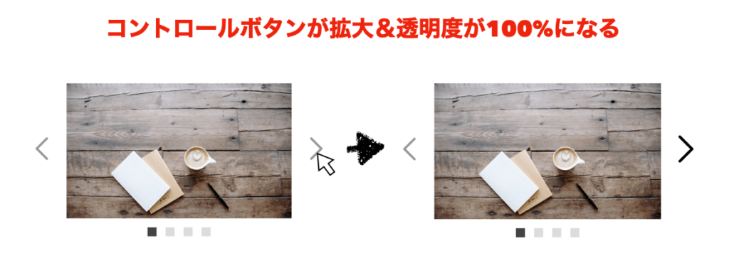
3. hoverでコントロールボタンが拡大&透明度100%のスライダーアニメーション
動きは下の画像のような感じになります
![]()
コードを見る
<div id="picture">
  <!-- チェックボックス -->
  <input type="radio" name="picture" id="pic1" checked>
  <input type="radio" name="picture" id="pic2">
  <input type="radio" name="picture" id="pic3">
  <input type="radio" name="picture" id="pic4">
  <div id="bg-pic">
    <div class="inside">
      <div class="pic pic_1">
      </div>
      <div class="pic pic_2">
      </div>
      <div class="pic pic_3">
      </div>
      <div class="pic pic_4">
      </div>
    </div>
  </div>
  <!-- スライダーのコントロールボタンを指定 -->
  <div id="slide-controls">
    <label for="pic1"></label>
    <label for="pic2"></label>
    <label for="pic3"></label>
    <label for="pic4"></label>
  </div>
  <!-- スライダーのナビゲーションボタン -->
  <div id="slide-buttons">
    <label for="pic1"></label>
    <label for="pic2"></label>
    <label for="pic3"></label>
    <label for="pic4"></label>
  </div>
</div>
#picture {
   margin: 0 auto;
   width: 500px;
   max-width: 100%;
   text-align: center;
}
#picture input[type=radio] {
   display: none;
}
#picture label {
   cursor:pointer;
   text-decoration: none;
   padding: 5px;
}
#bg-pic {
   background: #fff;
   position: relative;
   z-index: 1;
   width: 100%;
   overflow: hidden;
   /* ボックスのはみ打た部分を隠す */
}
/* スライダー画像の位置を比率で指定 */
#pic1:checked ~ #bg-pic .inside {
   margin-left: 0;
}
#pic2:checked ~ #bg-pic .inside {
   margin-left: -100%;
}
#pic3:checked ~ #bg-pic .inside {
   margin-left: -200%;
}
#pic4:checked ~ #bg-pic .inside {
   margin-left: -300%;
}
#bg-pic .inside {
   transition-duration:.8s;
   /* アニメーションの開始から終了までの時間を指定 */
   width: 400%;
   line-height: 0;
   height: 300px;
}
#bg-pic .pic {
   width: 25%;
   float:left;
   display: flex;
   justify-content: center;
   align-items: center;
   /* 上3行でボックスをど真ん中に指定 */
   height: 100%;
   background-size: cover;
}
/* 画像urlを指定 */
#bg-pic .pic_1 {
   background-image: url("https://images.unsplash.com/photo-1473181488821-2d23949a045a?ixlib=rb-1.2.1&ixid=eyJhcHBfaWQiOjEyMDd9&auto=format&fit=crop&w=1650&q=80");
}
#bg-pic .pic_2 {
   background-image: url("https://images.unsplash.com/photo-1442323794357-25b2ec110967?ixlib=rb-1.2.1&ixid=eyJhcHBfaWQiOjEyMDd9&auto=format&fit=crop&w=2850&q=80");
}
#bg-pic .pic_3 {
   background-image: url("https://images.unsplash.com/photo-1498550744921-75f79806b8a7?ixlib=rb-1.2.1&ixid=eyJhcHBfaWQiOjEyMDd9&auto=format&fit=crop&w=1650&q=80");
}
#bg-pic .pic_4 {
   background-image: url("https://images.unsplash.com/photo-1476820865390-c52aeebb9891?ixlib=rb-1.2.1&ixid=eyJhcHBfaWQiOjEyMDd9&auto=format&fit=crop&w=1650&q=80");
}
/* スライダーのコントロールボタンを指定 */
#slide-controls {
   margin: -180px 0 0 0;
   width: 100%;
   height: 50px;
   z-index: 3;
   position: relative;
}
#slide-controls label {
   display: none;
   width: 50px;
   height: 50px;
   opacity: .4;
   /* 透明度を指定 */
   transform: scale(1,1);
   /* XY軸(横縦)の伸縮率を指定 */
   transition:opacity .2s ease-out;
   /* アニメーションの時間を指定 */
}
#slide-controls label:hover {
   opacity: 1;
   /* 透明度を指定 */
   transform: scale(1.2,1.2);
   /* XY軸(横縦)の伸縮率を指定 */
}
#pic1:checked ~ #slide-controls label:nth-child(2),
#pic2:checked ~ #slide-controls label:nth-child(3),
#pic3:checked ~ #slide-controls label:nth-child(4),
#pic4:checked ~ #slide-controls label:nth-child(1) {
   background: url(https://image.flaticon.com/icons/svg/130/130884.svg) no-repeat;
   float:right;
   margin: 0 -80px 0 0;
   display: block;
}
#pic1:checked ~ #slide-controls label:nth-last-child(2),
#pic2:checked ~ #slide-controls label:nth-last-child(3),
#pic3:checked ~ #slide-controls label:nth-last-child(4),
#pic4:checked ~ #slide-controls label:nth-last-child(1) {
   background: url(https://image.flaticon.com/icons/svg/130/130882.svg) no-repeat;
   float:left;
   margin: 0 0 0 -80px;
   display: block;
}
/* スライダーの送りボタンを指定 */
#slide-buttons {
   margin: 150px 0 0;
   text-align: center;
}
#slide-buttons label {
   display: inline-block;
   width: 20px;
   height: 20px;
   border-radius:0%;
   background: gainsboro;
   margin: 0 10px;
   transform: scale(1,1);
   /* XY軸(横縦)の伸縮率を指定 */
   transition-duration:.5s;
   /* アニメーションの開始から終了までの時間を指定 */
}
#slide-buttons label:hover {
  transform: scale(1.5,1.5);
  /* XY軸(横縦)の伸縮率を指定 */
}
/* ナビゲーションボタンをcheckした時の背景色を指定 */
#pic1:checked ~ #slide-buttons label:nth-child(1),
#pic2:checked ~ #slide-buttons label:nth-child(2),
#pic3:checked ~ #slide-buttons label:nth-child(3),
#pic4:checked ~ #slide-buttons label:nth-child(4) {
   background: #444;
}
ここがポイント!
- flexboxでbg-picの中身をど真ん中に設置
- スライダーのナビゲーションボタンを設置しボタンを押すと画像がスライドするように指定する
- スライダーのコントロールボタンとナビゲーションボタンをhoverするとtransform:scaleでボタンが拡大するマテリアルデザイン(transformの使い方については【transform完全網羅】hoverで動き出す!transformを網羅できるCSSボタンアニメーション16選)
- スライダーのコントロールボタンをhoverすると透明度を調整するopacityが実行されて透明度が100%になるよう調整
- transition-durationプロパティを指定して開始から終了までの自然なアニメーションを実現
参考
そもそもWebデザインの基礎がわからない。。
 ふたご
ふたご
未経験からWeb制作で月50万稼げるようになったUdemy教材3選
でもなあ、独学だと心配だしプログラミングスクールで学びたい!。かといってお金はかけたくないし。。
ふたご
完全無料で一人前のエンジニアになれるプログラミングスクールあります
- プログラミング学習&サポートが無料!
- 誰もが知っている超優良企業への就職サポート付き!
- 学習言語:Java、PHP、HTML、CSSなど
話だけ聞いてみる

