AI(ChatGPT)を使って半自動で月5万稼ぐ?
実際にやってみて結果・・ >>

【解説付き】3Dマテリアルデザインをコピペで!CSSスライダーアニメーション3選(rotate編)

今回はtransform:rotateとbox-shadowを使用したそのまま使える3Dスライダーアニメーションのマテリアルデザインを3つご紹介します。

rotateを使用してhoverすると画像が回転するデザインに、box-shadowを使用することで3D画像が映像のように動き出すアニメーションデザインとなっています。

マテリアルデザインなのでそのまますぐにでもコピペして使用できるように仕上げました。

htmlとcssだけしか使っていません。
コードの説明や実際の動きも詳しくまとめてみたので自由にお使いください。

こちらのデザイン・コードはすべて完全オリジナルなのでコピペ大歓迎です。


1. hoverでリアル3D画像が拡大しながら迫ってくるスライダーアニメーション

動きは下の画像のような感じになります

コードを見る
<div id="picture">
  <!-- チェックボックス -->
  <input type="radio" name="picture" id="pic1" checked>
  <input type="radio" name="picture" id="pic2">
  <input type="radio" name="picture" id="pic3">
  <input type="radio" name="picture" id="pic4">
  <div id="bg-pic">
    <div class="inside">
      <div class="pic pic_1">
      </div>
      <div class="pic pic_2">
      </div>
      <div class="pic pic_3">
      </div>
      <div class="pic pic_4">
      </div>
    </div>
  </div>
  <!-- スライダーのナビゲーションボタン -->
  <div id="slide-buttons">
    <label for="pic1"></label>
    <label for="pic2"></label>
    <label for="pic3"></label>
    <label for="pic4"></label>
  </div>
</div>
#picture {
   margin: 0 auto;
   width: 500px;
   max-width: 100%;
   text-align: center;
}
#picture input[type=radio] {
   display: none;
}
#picture label {
   cursor:pointer;
   text-decoration: none;
   padding: 5px;
}
#bg-pic {
   background: #fff;
   position: relative;
   z-index: 1;
   width: 100%;
   overflow: hidden;
   /* ボックスのはみ打た部分を隠す */
   transform: scale(0.8,0.8) rotateX(40deg) rotateZ(-20deg);
   /* XY軸(横縦)の伸縮率と回転角度を指定 */
   box-shadow: -20px 20px 10px 5px rgba(0,0,0,0.6);
   /* ボックスに影をつける(左から水平方向の長さ、垂直方向の長さ、ぼかしの長さ、広がりの長さ、色) */
   transition-duration:.8s;
   /* アニメーションの開始から終了までの時間を指定 */
}
#bg-pic:hover {
  transform: scale(1,1) rotateX(0deg) rotateZ(0deg);
  /* XY軸(横縦)の伸縮率と回転角度を指定 */
}
/* スライダー画像の位置を比率で指定 */
#pic1:checked ~ #bg-pic .inside {
   margin-left: 0;
}
#pic2:checked ~ #bg-pic .inside {
   margin-left: -100%;
}
#pic3:checked ~ #bg-pic .inside {
   margin-left: -200%;
}
#pic4:checked ~ #bg-pic .inside {
   margin-left: -300%;
}
#bg-pic .inside {
   transition-duration:.8s;
   /* アニメーションの開始から終了までの時間を指定 */
   width: 400%;
   line-height: 0;
   height: 300px;
}
#bg-pic .pic {
   width: 25%;
   float:left;
   display: flex;
   justify-content: center;
   align-items: center;
   /* 上3行でボックスをど真ん中に指定 */
   height: 100%;
   background-size: cover;
}
/* 画像urlを指定 */
#bg-pic .pic_1 {
   background-image: url("https://images.unsplash.com/photo-1473181488821-2d23949a045a?ixlib=rb-1.2.1&ixid=eyJhcHBfaWQiOjEyMDd9&auto=format&fit=crop&w=1650&q=80");
}
#bg-pic .pic_2 {
   background-image: url("https://images.unsplash.com/photo-1442323794357-25b2ec110967?ixlib=rb-1.2.1&ixid=eyJhcHBfaWQiOjEyMDd9&auto=format&fit=crop&w=2850&q=80");
}
#bg-pic .pic_3 {
   background-image: url("https://images.unsplash.com/photo-1498550744921-75f79806b8a7?ixlib=rb-1.2.1&ixid=eyJhcHBfaWQiOjEyMDd9&auto=format&fit=crop&w=1650&q=80");
}
#bg-pic .pic_4 {
   background-image: url("https://images.unsplash.com/photo-1476820865390-c52aeebb9891?ixlib=rb-1.2.1&ixid=eyJhcHBfaWQiOjEyMDd9&auto=format&fit=crop&w=1650&q=80");
}
/* スライダーの送りボタンを指定 */
#slide-buttons {
   margin: 50px 0 0;
   text-align: center;
}
#slide-buttons label {
   display: inline-block;
   width: 20px;
   height: 20px;
   border-radius:0%;
   background: gainsboro;
   margin: 0 10px;
   transform: scale(1,1);
   /* XY軸(横縦)の伸縮率を指定 */
   transition-duration:.5s;
   /* アニメーションの開始から終了までの時間を指定 */
}
#slide-buttons label:hover {
  transform: scale(1.5,1.5);
  /* XY軸(横縦)の伸縮率を指定 */
}
/* ナビゲーションボタンをcheckした時の背景色を指定 */
#pic1:checked ~ #slide-buttons label:nth-child(1),
#pic2:checked ~ #slide-buttons label:nth-child(2),
#pic3:checked ~ #slide-buttons label:nth-child(3),
#pic4:checked ~ #slide-buttons label:nth-child(4) {
   background: #444;
}
ここがポイント!
  1. flexboxでbg-picの中身をど真ん中に設置
  2. スライダーのナビゲーションボタンを設置しボタンを押すと画像がスライドするように指定する
  3. hoverするとtransform:scaleで背景が拡大し浮き上がるスライダーのマテリアルデザイン(transformの使い方については【transform完全網羅】hoverで動き出す!transformを網羅できるCSSボタンアニメーション16選)
  4. box-shadowとtransform:rotateの組み合わせでリアルな3D画像を実現
  5. transform:rotateで画像の回転角度を指定してhover前と後で角度を変えることで商品紹介等で使える3D画像が浮き上がるデザインを実現
  6. transition-durationプロパティを指定して開始から終了までの自然なアニメーションを実現


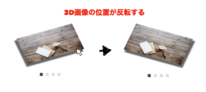
2. hoverでリアル3D画像が踊り出すスライダーアニメーション

動きは下の画像のような感じになります

コードを見る
<div id="picture">
  <!-- チェックボックス -->
  <input type="radio" name="picture" id="pic1" checked>
  <input type="radio" name="picture" id="pic2">
  <input type="radio" name="picture" id="pic3">
  <input type="radio" name="picture" id="pic4">
  <div id="bg-pic">
    <div class="inside">
      <div class="pic pic_1">
      </div>
      <div class="pic pic_2">
      </div>
      <div class="pic pic_3">
      </div>
      <div class="pic pic_4">
      </div>
    </div>
  </div>
  <!-- スライダーのナビゲーションボタン -->
  <div id="slide-buttons">
    <label for="pic1"></label>
    <label for="pic2"></label>
    <label for="pic3"></label>
    <label for="pic4"></label>
  </div>
</div>
#picture {
   margin: 0 auto;
   width: 500px;
   max-width: 100%;
   text-align: center;
}
#picture input[type=radio] {
   display: none;
}
#picture label {
   cursor:pointer;
   text-decoration: none;
   padding: 5px;
}
#bg-pic {
   background: #fff;
   position: relative;
   z-index: 1;
   width: 100%;
   overflow: hidden;
   /* ボックスのはみ打た部分を隠す */
   transform: scale(0.8,0.8) rotateX(40deg) rotateZ(-20deg);
   /* XY軸(横縦)の伸縮率と回転角度を指定 */
   box-shadow: -20px 20px 10px 5px rgba(0,0,0,0.6);
   /* ボックスに影をつける(左から水平方向の長さ、垂直方向の長さ、ぼかしの長さ、広がりの長さ、色) */
   transition-duration:.8s;
   /* アニメーションの開始から終了までの時間を指定 */
}
#bg-pic:hover {
  transform: scale(0.8,0.8) rotateX(-40deg) rotateZ(20deg);
  /* XY軸(横縦)の伸縮率と回転角度を指定 */
  box-shadow: 20px 20px 10px 5px rgba(0,0,0,0.6);
  /* ボックスに影をつける(左から水平方向の長さ、垂直方向の長さ、ぼかしの長さ、広がりの長さ、色) */
}
/* スライダー画像の位置を比率で指定 */
#pic1:checked ~ #bg-pic .inside {
   margin-left: 0;
}
#pic2:checked ~ #bg-pic .inside {
   margin-left: -100%;
}
#pic3:checked ~ #bg-pic .inside {
   margin-left: -200%;
}
#pic4:checked ~ #bg-pic .inside {
   margin-left: -300%;
}
#bg-pic .inside {
   transition-duration:.8s;
   /* アニメーションの開始から終了までの時間を指定 */
   width: 400%;
   line-height: 0;
   height: 300px;
}
#bg-pic .pic {
   width: 25%;
   float:left;
   display: flex;
   justify-content: center;
   align-items: center;
   /* 上3行でボックスをど真ん中に指定 */
   height: 100%;
   background-size: cover;
}
/* 画像urlを指定 */
#bg-pic .pic_1 {
   background-image: url("https://images.unsplash.com/photo-1473181488821-2d23949a045a?ixlib=rb-1.2.1&ixid=eyJhcHBfaWQiOjEyMDd9&auto=format&fit=crop&w=1650&q=80");
}
#bg-pic .pic_2 {
   background-image: url("https://images.unsplash.com/photo-1442323794357-25b2ec110967?ixlib=rb-1.2.1&ixid=eyJhcHBfaWQiOjEyMDd9&auto=format&fit=crop&w=2850&q=80");
}
#bg-pic .pic_3 {
   background-image: url("https://images.unsplash.com/photo-1498550744921-75f79806b8a7?ixlib=rb-1.2.1&ixid=eyJhcHBfaWQiOjEyMDd9&auto=format&fit=crop&w=1650&q=80");
}
#bg-pic .pic_4 {
   background-image: url("https://images.unsplash.com/photo-1476820865390-c52aeebb9891?ixlib=rb-1.2.1&ixid=eyJhcHBfaWQiOjEyMDd9&auto=format&fit=crop&w=1650&q=80");
}
/* スライダーの送りボタンを指定 */
#slide-buttons {
   margin: 50px 0 0;
   text-align: center;
}
#slide-buttons label {
   display: inline-block;
   width: 20px;
   height: 20px;
   border-radius:0%;
   background: gainsboro;
   margin: 0 10px;
   transform: scale(1,1);
   /* XY軸(横縦)の伸縮率を指定 */
   transition-duration:.5s;
   /* アニメーションの開始から終了までの時間を指定 */
}
#slide-buttons label:hover {
  transform: scale(1.5,1.5);
  /* XY軸(横縦)の伸縮率を指定 */
}
/* ナビゲーションボタンをcheckした時の背景色を指定 */
#pic1:checked ~ #slide-buttons label:nth-child(1),
#pic2:checked ~ #slide-buttons label:nth-child(2),
#pic3:checked ~ #slide-buttons label:nth-child(3),
#pic4:checked ~ #slide-buttons label:nth-child(4) {
   background: #444;
}
ここがポイント!
  1. flexboxでbg-picの中身をど真ん中に設置
  2. スライダーのナビゲーションボタンを設置しボタンを押すと画像がスライドするように指定する
  3. hoverするとtransform:scaleで背景が拡大し浮き上がるスライダーのマテリアルデザイン(transformの使い方については【transform完全網羅】hoverで動き出す!transformを網羅できるCSSボタンアニメーション16選)
  4. box-shadowとtransform:rotateの組み合わせでリアルな3D画像を実現
  5. transform:rotateで画像の回転角度を指定してhover前と後で角度を変えることで3D画像の位置がスムーズに変わるデザインを実現
  6. transition-durationプロパティを指定して開始から終了までの自然なアニメーションを実現


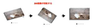
3. hoverでリアル3D画像が手裏剣みたいに回転するスライダーアニメーション

動きは下の画像のような感じになります

コードを見る
<div id="picture">
  <!-- チェックボックス -->
  <input type="radio" name="picture" id="pic1" checked>
  <input type="radio" name="picture" id="pic2">
  <input type="radio" name="picture" id="pic3">
  <input type="radio" name="picture" id="pic4">
  <div id="bg-pic">
    <div class="inside">
      <div class="pic pic_1">
      </div>
      <div class="pic pic_2">
      </div>
      <div class="pic pic_3">
      </div>
      <div class="pic pic_4">
      </div>
    </div>
  </div>
  <!-- スライダーのナビゲーションボタン -->
  <div id="slide-buttons">
    <label for="pic1"></label>
    <label for="pic2"></label>
    <label for="pic3"></label>
    <label for="pic4"></label>
  </div>
</div>
#picture {
   margin: 0 auto;
   width: 500px;
   max-width: 100%;
   text-align: center;
}
#picture input[type=radio] {
   display: none;
}
#picture label {
   cursor:pointer;
   text-decoration: none;
   padding: 5px;
}
#bg-pic {
   background: #fff;
   position: relative;
   z-index: 1;
   width: 100%;
   overflow: hidden;
   /* ボックスのはみ打た部分を隠す */
   transform: scale(0.7,0.7) rotateX(40deg) rotateZ(-15deg);
   /* XY軸(横縦)の伸縮率と回転角度を指定 */
   box-shadow: -20px 20px 10px 5px rgba(0,0,0,0.6);
   /* ボックスに影をつける(左から水平方向の長さ、垂直方向の長さ、ぼかしの長さ、広がりの長さ、色) */
   transition-duration:.8s;
   /* アニメーションの開始から終了までの時間を指定 */
}
#bg-pic:hover {
  transform: scale(0.75,0.75) rotateX(0deg) rotateZ(360deg);
  /* XY軸(横縦)の伸縮率と回転角度を指定 */
}
/* スライダー画像の位置を比率で指定 */
#pic1:checked ~ #bg-pic .inside {
   margin-left: 0;
}
#pic2:checked ~ #bg-pic .inside {
   margin-left: -100%;
}
#pic3:checked ~ #bg-pic .inside {
   margin-left: -200%;
}
#pic4:checked ~ #bg-pic .inside {
   margin-left: -300%;
}
#bg-pic .inside {
   transition-duration:.8s;
   /* アニメーションの開始から終了までの時間を指定 */
   width: 400%;
   line-height: 0;
   height: 300px;
}
#bg-pic .pic {
   width: 25%;
   float:left;
   display: flex;
   justify-content: center;
   align-items: center;
   /* 上3行でボックスをど真ん中に指定 */
   height: 100%;
   background-size: cover;
}
/* 画像urlを指定 */
#bg-pic .pic_1 {
   background-image: url("https://images.unsplash.com/photo-1473181488821-2d23949a045a?ixlib=rb-1.2.1&ixid=eyJhcHBfaWQiOjEyMDd9&auto=format&fit=crop&w=1650&q=80");
}
#bg-pic .pic_2 {
   background-image: url("https://images.unsplash.com/photo-1442323794357-25b2ec110967?ixlib=rb-1.2.1&ixid=eyJhcHBfaWQiOjEyMDd9&auto=format&fit=crop&w=2850&q=80");
}
#bg-pic .pic_3 {
   background-image: url("https://images.unsplash.com/photo-1498550744921-75f79806b8a7?ixlib=rb-1.2.1&ixid=eyJhcHBfaWQiOjEyMDd9&auto=format&fit=crop&w=1650&q=80");
}
#bg-pic .pic_4 {
   background-image: url("https://images.unsplash.com/photo-1476820865390-c52aeebb9891?ixlib=rb-1.2.1&ixid=eyJhcHBfaWQiOjEyMDd9&auto=format&fit=crop&w=1650&q=80");
}
/* スライダーの送りボタンを指定 */
#slide-buttons {
   margin: 50px 0 0;
   text-align: center;
}
#slide-buttons label {
   display: inline-block;
   width: 20px;
   height: 20px;
   border-radius:0%;
   background: gainsboro;
   margin: 0 10px;
   transform: scale(1,1);
   /* XY軸(横縦)の伸縮率を指定 */
   transition-duration:.5s;
   /* アニメーションの開始から終了までの時間を指定 */
}
#slide-buttons label:hover {
  transform: scale(1.5,1.5);
  /* XY軸(横縦)の伸縮率を指定 */
}
/* ナビゲーションボタンをcheckした時の背景色を指定 */
#pic1:checked ~ #slide-buttons label:nth-child(1),
#pic2:checked ~ #slide-buttons label:nth-child(2),
#pic3:checked ~ #slide-buttons label:nth-child(3),
#pic4:checked ~ #slide-buttons label:nth-child(4) {
   background: #444;
}
ここがポイント!
  1. flexboxでbg-picの中身をど真ん中に設置
  2. スライダーのナビゲーションボタンを設置しボタンを押すと画像がスライドするように指定する
  3. hoverするとtransform:scaleで背景が拡大し浮き上がるスライダーのマテリアルデザイン(transformの使い方については【transform完全網羅】hoverで動き出す!transformを網羅できるCSSボタンアニメーション16選)
  4. box-shadowとtransform:rotateの組み合わせでリアルな3D画像を実現
  5. transform:rotateで画像の回転角度を指定してhover前と後で角度を変えることでリアルな3D画像が手裏剣のように回転しながら拡大するデザインを実現
  6. transition-durationプロパティを指定して開始から終了までの自然なアニメーションを実現


参考

そもそもWebデザインの基礎がわからない。。
そんなあなたにはこれ!

ふたご


でもなあ、独学だと心配だしプログラミングスクールで学びたい!。かといってお金はかけたくないし。。
そんなあなたにはこれ!

ふたご

完全無料で一人前のエンジニアになれるプログラミングスクールあります
  1. プログラミング学習&サポートが無料!
  2. 誰もが知っている超優良企業への就職サポート付き!
  3. 学習言語:Java、PHP、HTML、CSSなど


   話だけ聞いてみる